X. Showing True Colors: Digitization and the Importance of Accurate Color Capture
- Cynthia Kurtz
No experience will ever be able to match standing before a great masterpiece, soaking in every inch as your eyes scan the surface, moving from point to point, color receptors firing as each hue strikes the retina and elicits a response in the brain. Perhaps it is awe, or sadness, or confusion: whatever the artist intended the audience to see and feel as they viewed the work. Colors have a strong impact on emotion, and artists have long been carefully selecting their palettes to convey more than just a picture. However, natural deterioration can lead to the magnificence of an object fading over time, or a natural disaster can see it lost in a moment, gone in flames like the collection at Brazil’s National Museum.
These are the situations in which digitization can be life-changing or -saving. Individuals who may not be able to travel to see a Van Gogh can comfortably view a digitized copy on their own computer; should anything ever happen to the physical piece of art, its ghost can live on in cyberspace. Considered in these regards, that digitized versions may be the closest many people now or in the future will ever be to a work of art, the need for exact color replication becomes abundantly clear. This paper will discuss methods that can be employed to increase color verity, from the act of capturing the image to the dissemination of the image to the greater public. Technological advances and variances, as well as the physical nature of light and color and the biology of human vision all play a part in accurately capturing the colors present in an object. Scholarly sources and the author’s own experience as an intern at the National Sporting Museum and Library under the guidance of George L. Ohrstrom, Jr. Head Curator Claudia Pfeiffer, as well as the author’s previous background as a pre-med student at Tulane University, will provide the basis of these arguments and recommendations.
Physics: how color works
Color is a large and complex phenomenon, so much so that it has its own branch in the study of physics. Optics is the branch of science that studies light and its interactions with matter, including devices and apparatuses that use or detect it to accomplish a task. This could include observing the way light is distorted when travelling through air or water or studying the way the human eye or camera reacts to specific wavelengths. Color is caused by the reflection and perception of light moving in a highly specific manner.
Light travels as a wave through space. The wave can be wide or narrow, tall or shallow, and can oscillate slowly or quickly. Each of these traits is measurable and dictates how the wave of light will interact with matter it encounters.
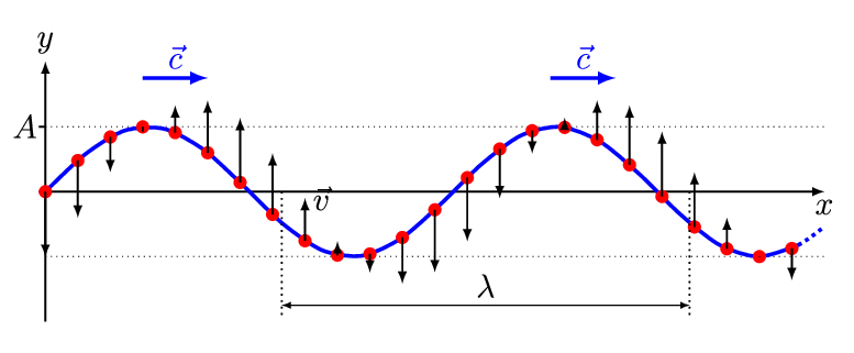
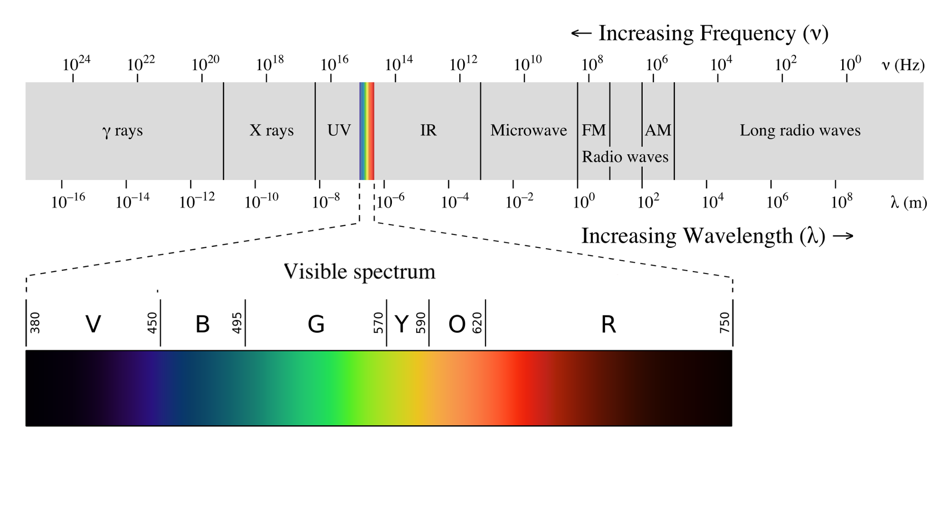
Wavelength is a measure of the distance between two wave crests. This is the most important measurement when working with color, as each specific wavelength corresponds to a single color within the visible region of the spectrum. Wavelength can vary from less than 10^-12^ meters to over 1,000 meters; the visible region, or that which the typical human eye can perceive, is widely considered to be from 380–740 nanometers.1 Within this range color progresses from violet to red as wavelength increases.
The opposite of wavelength is frequency, or the number of times a wave of light passes through a specific point in space within a specific time. The shorter the wavelength, the greater the frequency, and vice versa. Because these two traits are linked, frequency can also be said to dictate the color of a wave of light.
Of course, considering light as a single wave, while useful for demonstrating these concepts, is not a realistic model. Light is comprised of many thousands of waves travelling through space all at once, often colliding and mixing with each other. This introduces a third variable: saturation. The light striking and reflecting off any given object is likely to be comprised of waves of several differing wavelengths. Saturation is a measurement of the variability of wavelengths present in such a sample of light.2 Saturated light consists of waves that have similar wavelengths. In the visible spectrum, this would cause the color to appear very vibrant. Less saturated light may contain waves with vastly different wavelengths, which can serve to cancel each other out and diminish the vibrancy of the color. Fully unsaturated light, an even mix of all wavelengths in the visible spectrum, would present as pure white. Saturated light in the red-to-yellow range is considered warm, while light more saturated in the blue and violet end of the spectrum is cool, a trait referred to as the color’s temperature.3
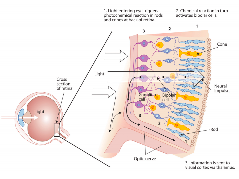
Biology: how humans work
The average human being has nearly 14 million cells dedicated to interpreting color. These highly specialized “cone cells” are located across the retina at the back of each eye. Every object you see sets off a cascade of reactions, electrical signals darting through your nerves to the occipital lobe of the brain, forming an image for you to ponder, evaluate, and maybe even enjoy. The perception of color must be an important trait for the human body to devote so many resources to it; in comparison, humans only have 10,000 cells dedicated to the sense of taste, and each finger has merely 3,000 cells for interpreting touch. This allocation of resources reflects humans’ deep reliance on color not just for survival but for communication and emotional satisfaction.
Each cone cell is specially configured to react to a specific range of light wavelengths. When this appropriate wavelength travels through the eye and hits the retina, the responsible cone cells “light up” and send a signal to the brain, communicating the intensity, relative location, and quality of the color perceived. Slight overlap between the wavelengths of light detected by each cone, and how strongly they react, allows the brain to pinpoint a more specific color.4 The more cone cells a person has, the more diverse a range of colors they can perceive, and the greater their ability to discern the difference between two very similar colors. Color-blindness occurs when a person fails to develop cone cells of one or more types, leading to an inability to receive stimulus from those wavelengths of light.5
The goal then, in order to give the viewer of a digitized work of art the most truthful experience, is to have the waves of light emitted from the digital projection, most likely on a computer screen or other similar device, exactly match those that would be reflecting off the original work of art into the viewer’s eye.
Lights: how to improve color
If capturing colors in a photograph can be considered as capturing light, containing it for release elsewhere, what is the best way to maximize the chances of capturing the exact right light? Having a lot of it. A well-lit studio is essential, but this does not mean simply filling the area with lights of all shapes and sizes and hoping for the best. Sources must be carefully curated to match exactly, reducing interference and allowing accurate color capture of the entire object.
The light should be as unsaturated as possible to allow for the most truthful reflections of the pigments present in the artwork, as color temperature can affect how the camera, and thus the future viewer, will perceive the work of art.6 Humans are able to adjust for differences in color temperature when viewing an object in person but cameras lack this problem-solving ability, making it imperative that light sources used in photography be as ideal as possible.
The first consideration must be any sources of natural sunlight, which must be blocked wherever possible. The earth’s atmosphere is most effective at filtering out longer wavelengths of visible light, such as reds and yellows. This causes sunlight to be more saturated in blue wavelengths, giving it a bluish tinge. Changes in atmospheric conditions due to weather or time of day can lead to fluctuations that can be hard to account for and counteract, especially in post-production editing.
Artificial light, then, should be the only source used. The object or work of art should be well illuminated by free-standing lights that remain lit for the duration of the shoot. Paired lights are best, as they can evenly light the object from two different directions, allowing even coverage and cancelling out interference that distorts color. Full spectrum bulbs, which in theory provide completely unsaturated light, will correct color temperature to a large extent. The flash on the camera should not be considered a viable light source, as it is a high-intensity beam of light that is nearly impossible to control and to correct for should variations in temperature occur.
Camera: how to capture color
While there is a large range of camera models and types available on the market, the basic apparatus for capturing a photograph is largely consistent.
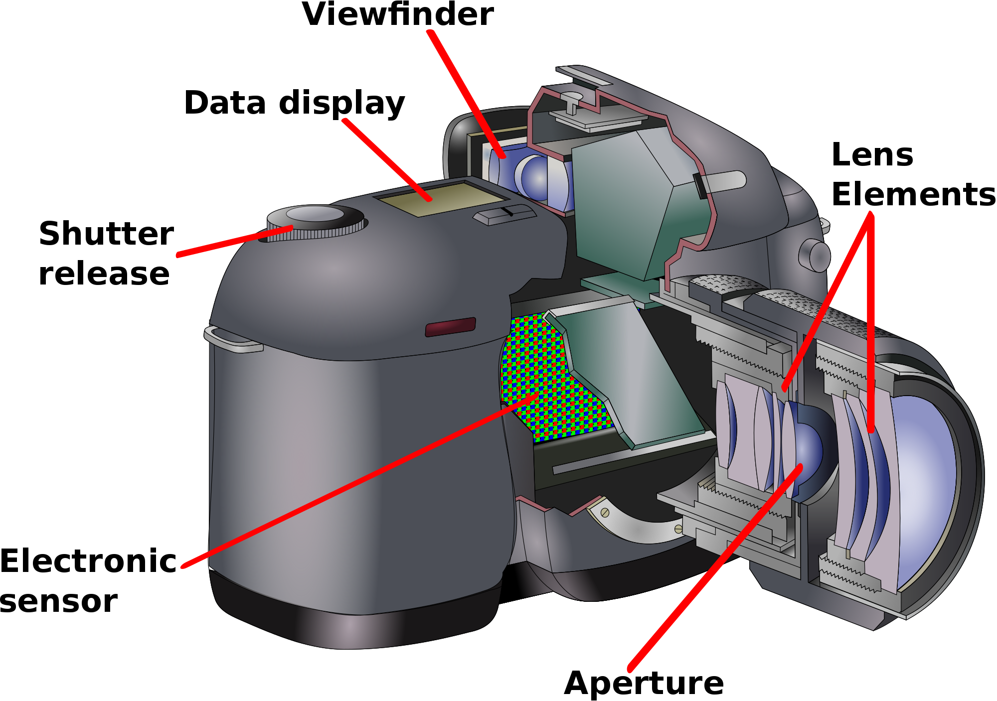
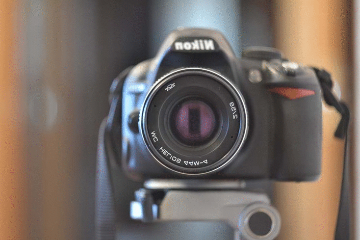
Most importantly, light must have a way to enter the camera. It does so through the lens, the curved glass piece at the front of the camera. The shape of the lens focuses the light coming into the camera and aims it at the sensors that will be responsible for taking the picture. The lens plays a large role in the sharpness of an image—or how clear it is—and in the magnification. These are important considerations when digitizing a work of art, but do not have much impact on color accuracy.
After passing through the lens, light must pass through the camera’s aperture. This is a small opening that opens and closes to control when light is hitting the image sensors. It is also possible to control the size of this opening. The size of the aperture is measured in f-stops: the lower the number, the larger the aperture. A large aperture will allow in a lot more light than a smaller aperture, but at the expense of depth of field, or the range of distances at which objects in an image will be in focus.7 Because works of art are always three-dimensional objects—even paintings—a large depth of field is incredibly important in order to capture every detail. This is achieved by using the highest aperture setting where the camera is still able to capture a sharp image of the entire object: Pfeiffer typically uses f/11 or f/16 depending on the type of artwork. A watercolor painting, for instance, can be shot at a lower aperture setting than a bronze sculpture since the object itself is not as deep.8
It is also possible to control the shutter speed, or how long the aperture is open. The longer it is open, the more light is allowed to pass through to the sensors. The exact right amount of light must reach the sensors in order to capture a color-accurate picture. When using a high, or small, aperture, shutter speed must be increased in turn in order to make up for the reduced amount of light passing through the aperture. Unfortunately, slow shutter speed makes the camera much more sensitive to any movement and cause blurring.9 This is typically not an issue, since artwork does not tend to move much, but the camera itself could. It is important to use a tripod or a stand to eliminate motion from a human hand holding it in place. It is also helpful to use remote shutter control, either on a computer or a handheld device, to prevent the slight movement that can occur when pressing the shutter button on the camera itself. If the shutter is open long enough, even these minute movements can cause serious blurring of the image.
Finally, the light reflecting off of the subject will hit the sensors inside the camera and trigger a chain reaction that creates the photo. The sensitivity of a camera’s sensor is called the ISO, and, like aperture and shutter speed, is adjustable. A high ISO setting means the sensor will be more sensitive to any light that hits it, improving ability of the camera to capture images in low-light scenarios, while a low ISO means decreased sensitivity.10 It may seem counter-intuitive, but a lower ISO setting is actually ideal in most instances.11 The heightened sensitivity at higher ISO settings introduces a phenomenon known as “noise,” or a grainy appearance. This is caused by the sensor picking up not only the light waves reflected directly off the object, but also waves of light that have collided and interfered with each other on their path to the camera causing color distortion. As previously discussed, digitization is almost exclusively being done in environments with more than sufficient lighting, so a low ISO is preferred in order to reduce noise and distortion.
These three settings—aperture, speed, and ISO—together affect what is known as the “exposure” of a photograph. Exposure can be roughly defined as the amount and quality of light that was used to create an image. An exact amount of light is needed to capture a color-accurate image: too much light causes a picture to be over-exposed, or too bright, and too little light causes under-exposure, or an image that is too dark. Most cameras will allow the photographer to adjust each of these settings individually to tailor to the exact lighting conditions, but Pfeiffer argues this is unnecessary and the camera should be relied upon to make some of the decisions for you.12 By using the camera’s automatic aperture-priority mode, the photographer can specify what size aperture the camera should use and at what ISO setting, and the camera will automatically calculate the appropriate shutter-speed based on the light levels it detects to get the best exposure. This gives the photographer great control over how detailed and clear the photo will be but does not require manual measurements or extensive testing to achieve adequate exposure.

Post-production: how to adjust and store color
Despite this level of control over the light environment and the photography equipment, it is inevitable that further image processing will be needed in order to completely correct distortions caused by photography equipment. Calibrating the computer and camera to the light environment can be quite useful, and a myriad of products on the market can help identify the light levels present when a photograph is taken. One such device utilized at the National Sporting Museum and Library is the SpyderCube. Each side is painted with a specific pattern of white and gray shades, and a hole in one side creates a “true black” shadow. When the SpyderCube is photographed in specific light settings, the accompanying software, when installed on the computer, can read the gray portion of the cube in the resulting image and make the calculations needed to correct that section of color to its true hue. It can then apply those color corrections to every color in the image.
Images generated by the camera should be transmitted to the computer as RAW files. This file type is massive, due to the copious amount of information it contains. Every single pixel carries with it its own metadata encoding its color and appearance. The computer used to view and edit the RAW files must be equipped with software capable of reading and editing the file type; Adobe Photoshop and GIMP are common options. Photoshop is the most commonly used photo-editing platform and is an incredibly powerful program with a price-tag to match.13 GIMP is available as a free and open-source program and has many of the same capabilities as Photoshop. It is not as robust, however, and more limited in the types of files it can process and how many channels of color it can handle, but it is free and does not have any restrictions on commercial use making it a good option for museums with limited budgets to dip their toes in the water.14
The RAW file is the best place to perform corrections to the color of the digitized image, as this is the only format in which the metadata is readily accessible for editing. As well as color corrections, this is a good stage in which to perform other edits that may be needed. If the camera was not exactly parallel to the artwork when the photograph was taken, slight adjustments in perspective can be made to the RAW file. Silhouettes can be made of the object, especially of sculptures, for graphic design or marketing purposes, by removing any background pixels present in the RAW file and replacing them with a transparent frame.
The RAW file, because of the way each individual pixel is encoded independently, is the most color realistic of any file type. Unfortunately, it is far to massive and specialized for dissemination to the general public, and in some instances storing such large files is prohibitive for museums with limited means. Digital storage, though massive in scope and availability, is still a finite resource. Off-line storage solutions, owned and operated by the museum, are constrained by disk space. A single computer or storage device can only hold so much data before it is full. On-line/off-site storage of files can eliminate this constraint, but with significant cost, as the museum must pay a third-party contractor to manage their storage for them.15 In addition, the movement of files this large is time- and resource-consuming for both the museum and the recipient. Images on websites that are in RAW format take much longer to load due to their size, making the entire website slow and frustrating to use. Users with low bandwidth or internet speed, such as someone in a rural area relying on satellite internet, may not even be able load such pages.
These scenarios are where JPEGs come in. The JPEG file type is a highly compressed image format compared to RAW, making it much smaller in size and therefore less of a strain on storage and sharing capabilities. It uses an algorithm to remove the metadata of pixels that are closely related; these pixels are consequently expressed relative to a single set of metadata to which the algorithm can make minor changes. The algorithm can be manipulated to control how similar pixels are allowed to be before they are grouped together. The less variation that is allowed between two pixels being grouped, the closer the JPEG file will appear to the original RAW file. Consequently, it will also be larger in size as it is forced to carry more metadata. Still, any image saved in JPEG format will be smaller than the RAW version, so it is best to try and facilitate as high a quality conversion as possible. After the image has been converted it can still be adjusted for color balance or background removal, but it becomes more difficult to apply fine-tuned corrections as the pixels are grouped together inseparably.
Any camera capable of shooting in RAW format can also shoot in JPEG instead. While this may seem like an ideal solution to the storage problems usage of RAW files presents, it comes at a great cost to color accuracy and the ability to fine-tune images. When a camera creates a JPEG file, it makes its own decisions regarding which pixels to keep and which to associate with other pixels. It also accepts the lighting and color conditions of the captured image as fact, removing any extraneous data that don’t fit what the camera has decided were the actual conditions.16 This means that a computer tasked with making color adjustments has a lot less information to work with and has to make more “guesses,” which introduces opportunity for error. For these reasons, it is imperative that the RAW file is transmitted from the camera to the computer and then converted to a JPEG in order to preserve as much information about the true colors of the image as possible. It is also important to save the RAW file as well, in case later adjustments or corrections must be made or if the compressed file becomes corrupted.17
Viewing: how to share color
Every step of taking and saving the image is vitally important when capturing color in an accurate manner. Unfortunately, in the end, an image is only as good as the medium it’s viewed on. Monitors and other devices for displaying images have huge potential for variation, from constraints presented by the physical technology to settings made in the software running it. Depending on who is viewing the image, and for what purpose, only some of these constraints can be mitigated.
Within the museum’s walls and on institutional equipment, a uniform viewing experience isn’t too difficult to achieve. Computer screens can be calibrated using special equipment related to the SpyderCube. A sensor observes the monitor as it runs through a series of colors and detects whether the screen is displaying the exact colors the software program is telling it to. It can then trigger the system to adjust the screen’s light levels and color intensities to match the calibration software’s intentions. This not only serves to force multiple machines to match but ensures that each one is displaying the correct information.
It may also be possible for museums to share this calibration information with each other. In this day and age, objects on loan from one museum to another are often accompanied by digital reproductions for use in documentation, research, or even marketing. The providing institution frequently includes directions as to how those images are allowed to be used according to copyright or licensing, but, if they so desire, they can also provide instruction on how those images should be viewed, even within the organization.
Calibrating visual equipment in-house and among partner institutions is a strong method to prevent discrepancies when viewing digitized work for museum purposes, such as condition reporting or archiving, but it would be unreasonable to expect every member of the public viewing an image on-line to have the knowledge, expertise, equipment, or resources to perform such exact calibrations on their own devices. Most modern computers come with a default color calibration module that relies on the user’s color perception and a series of sliders to adjust the appearance of the screen. These modules are better than nothing, and their use on a device has far-reaching benefits that extend beyond viewing works of art. If possible, museums should explain and encourage the use of these built-in calibration tools to viewers of digital collections. The casual user may not want to put so much effort into what they see as simple observation of a work of art, but providing the guidance in case they do wish to enhance their viewing experience is a relatively easy step for the museum to take.
The reality, however, is that a large portion of audience members viewing digitized versions of artwork in museum collections will be doing so on a tablet or mobile phone. At time of publication, there are no viable color calibration tools or software widely available to the public for use on these devices. Some newer phones may allow for a selection between a handful of color profiles—for instance, Google’s Pixel 2 XL allows users to choose between “boosted,” “natural,” or “saturated” color settings—but these adjustments are intended for comfort and preference, not authenticity, and do not allow further customization or calibration.18
Why
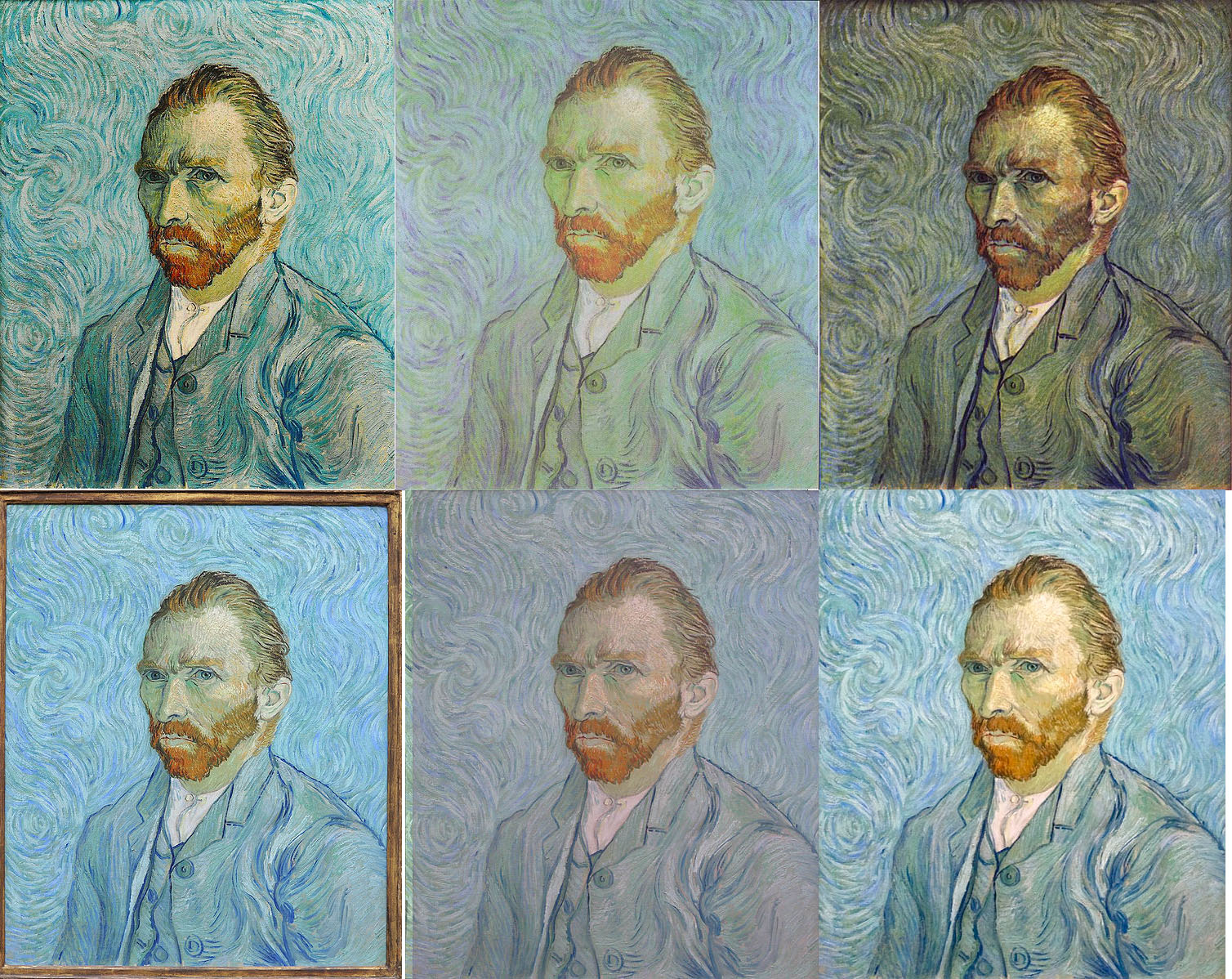
If the museum is not taking the necessary steps to create and then provide access to color-accurate digital versions of their collections, then they are giving up control of how those works of art will be viewed and interpreted by a truly global public. In addition, if the images the museum itself is providing are not accurate to the original work, they are betraying the trust their community has in them to provide an authentic experience and diminishing their own authority on the piece in question. When these images are used on the web, it can distort viewers’ perceptions of what the work is really like. In one example, the Rijksmuseum in Amsterdam, Netherlands, found that visitors did not think the postcards depicting Vermeer’s The Yellow Milkmaid were accurate because they did not match the versions they had seen on-line.19 This phenomenon, when multiple digital versions exist but look completely different, is now known as The Yellow Milkmaid Syndrome.20
Inaccurate digital versions of real-life works of art can have lasting consequences. Museums have authority over the objects in their care, an authority that comes with great responsibility. If an institution is going to seek to control the way its objects will be interpreted by its visitors, it has a moral duty to make those interactions as life-like and authentic as possible. Nothing can ever compare to viewing a great masterpiece with one’s own eyes, but with the appropriate techniques and right equipment, a museum’s digital reproduction can get pretty close.
Notes
- 1 nanometer is 10^-9^ meters. For comparison, the smallest length the human eye can detect is 10^-4^ meters, which is five times larger. Hadhazy, Adam. “What Are the Limits of Human Vision?” BBC Future. BBC, July 27, 2015. https://www.bbc.com/future/article/20150727-what-are-the-limits-of-human-vision. ↩
- Briggs, David. “Saturation.” The Dimensions of Colour, January 30, 2017. http://www.huevaluechroma.com/017.php. ↩
- King, Julie. Digital Photography for Dummies, 8th Edition. Hoboken, NJ: John Wiley & Sons, Inc., 2016, p. 162-64 ↩
- Hadhazy, Limits of Human Vision. ↩
- Robson, David. “The Women with Superhuman Vision.” BBC Future. BBC, September 5, 2014. https://www.bbc.com/future/article/20140905-the-women-with-super-human-vision. ↩
- Bhattacharjee, Amrita, and Pal, Swati. “Effect of Color Temperature on Appearance of Paintings Exhibited Under LED Lighting.” Color Research & Application 44, no. 5 (October 2019): 762–771. ↩
- King, Digital Photography, p. 26 ↩
- Interview with Claudia Pfeiffer, George L. Ohrstrom, Jr. Head Curator at The National Sporting Museum and Library in Middleburg, VA. Interview by author. November 11, 2019. ↩
- King, Digital Photography, 110-14, 118-20. ↩
- Ibid., p. 114-17 ↩
- Interview with Claudia Pfeiffer, November 11, 2019 ↩
- Ibid. ↩
- “Photoshop apps - desktop, mobile, and tablet.” Adobe. Accessed November 12, 2019. https://www.photoshop.com/. ↩
- GIMP. Accessed November 12, 2019. https://www.gimp.org/. ↩
- Wright, Richard. “Issues of Scale and Storage in Digital Preservation.” In Multimedia Information Extraction and Digital Heritage Preservation, 361–80. Singapore: World Scientific Publishing Co Pte Ltd, 2011. https://ebookcentral.proquest.com/lib/gwu/detail.action?docID=840599, p. 363-367 ↩
- King, Digital Photography, p. 20, 168-69 ↩
- Wright, “Issues of Scale and Storage,” p. 373-74. ↩
- Martonik, Andrew. “Google Pixel 2 XL Adds New Display Profiles, UI Changes to Address Burn-In.” Android Central, November 7, 2017. https://www.androidcentral.com/pixel-2-xl-adds-boosted-and-saturated-display-profiles-latest-update. ↩
- Verwayen, Harry, Martijn Arnoldus, and Peter B. Kaufman. “Europeana Whitepaper No. 2: The Problem of the Yellow Milkmaid.” Europeana Pro, November 2011. https://pro.europeana.eu/files/Europeana_Professional/Publications/Whitepaper_2-The_Yellow_Milkmaid.pdf. ↩
- Stierch, Sarah, “Yellow Milkmaid Syndrome,” Tumblr, March 14, 2017, https://yellowmilkmaidsyndrome.tumblr.com/ ↩